
Design System Work
Throughout my career as a Product Designer, I've worked with design systems across different products and teams.
These experiences taught me that there's no one-size-fits-all approach to design systems. The right level of structure, customization, and documentation depends on the product's stage, user needs, and engineering resources.
Contributions to:
Hyfe
UI Libraries for Mobile & Web
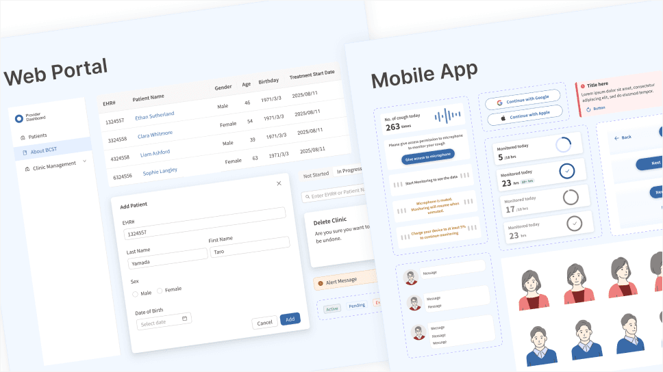
At Hyfe, I worked on UI libraries for a patient mobile app and a healthcare provider web portal. The products shared some visual elements, including illustrations, but used separate component libraries tailored to their needs.
Evolving a Mobile Component Library
I extended an existing mobile component library, adapting reusable components, typography styles, and interaction states for a new digital therapeutic product.
Establishing Design Consistency
As our design team grew from one designer to two, I noticed inconsistencies across our designs. I worked with the other designer to establish shared conventions and introduced a review process to improve consistency and reduce confusion for engineers.
Building a Web UI Foundation with Ant Design
I led the evaluation of UI libraries for our healthcare provider portal and recommended Ant Design. This allowed us to support complex clinical workflows without the engineering overhead of building a custom component library.
Money Forward
Design System
Improving design-to-code alignment
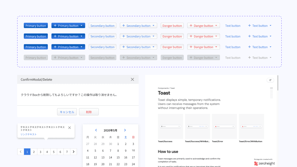
Alongside creating reusable components as the product evolved, I took the initiative to introduce Storybook for component QA during a frontend framework migration. I also conducted visual and interaction reviews with engineers to ensure consistency between design and implementation.
These efforts reduced UI correction cycles from approximately 2–3 to 0–1 rounds per frontend change.
Documentation
As the team grew and designers frequently changed, I created documentation for core design foundations and UI components, including typography, buttons, pagination, tooltips, and toast notifications.
The documentation helped new designers onboard more easily and provided clear guidelines for using components consistently across the product.
hab
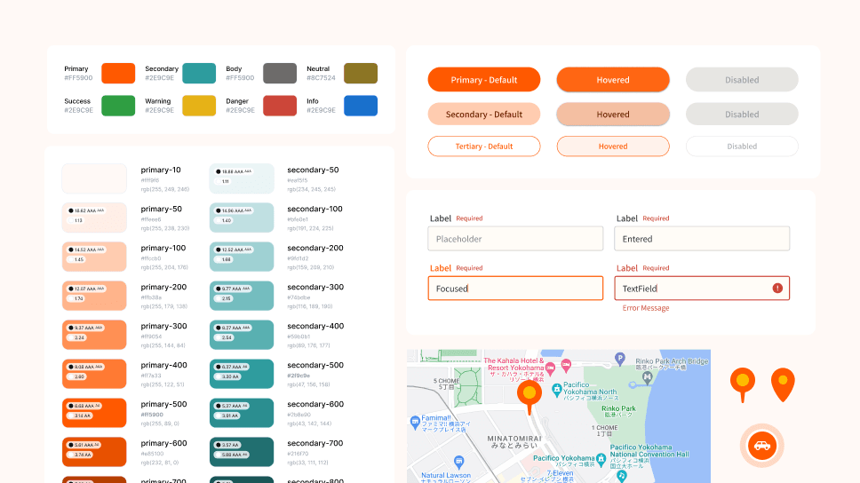
Shared UI library across Mobile & Web
As the first and sole designer at hab, I extended the company's brand identity into its digital products by establishing visual foundations, including colour palettes.
I built reusable UI components using MUI while designing a driver app, a responsive website for parents, and desktop-based dashboards. This helped maintain consistency across different platforms while accommodating their unique interaction needs.